
Project
Massage Heights National Marketing Campaign - Q2 2022
Deliverables
Art Direction and Production Design for Mother’s Day, Father’s Day, and Margarita Foot Scrub marketing promotions
• Campaign Art Direction
• Window Cling
• Door Signs
• Flyers
• Social/Digital Ads
• Counter Cards
• Gift Card Insert
• Gift Card Envelope

The Process
For each quarter our Chief Brand Officer has designated themes to incorporate into all marketing efforts. For Q2 the theme is Renew & Flourish. From here I am responsible for brainstorming and designing the creative campaign as well as the design production of all assets.
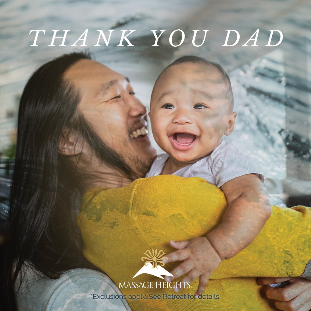
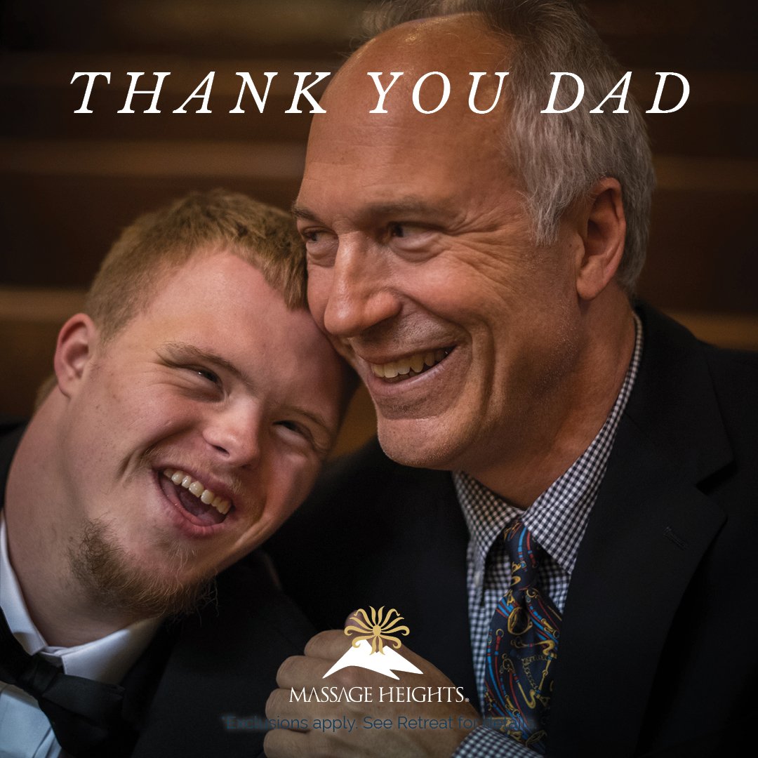
In an effort to increase diversity in our advertising I created 3 concepts around Mother’s and Father’s with expanded representation of our members and guests that we have not shown previously.
For concepts, they are broken into categories of growth.
1: A concept that is safe and comfortable. Follows previous marketing campaigns and will not push stakeholders out of their comfort zone.
2: A concept that pushes the boundaries a little.
3: A concept that will make stakeholders sweat and push the boundaries of the brand.
After I create the concepts the marketing team then determines the top choice for stakeholder review based on BDEF
Benefit- Is it coming through?
Differentiate- Does it have stopping power?
Emotive- Does it evoke an emotional response?
Flexibility - Does the concept translate across asset platforms?
Stakeholders
The stakeholders in the design process who review and have final decision power on designs are the CEO, Chief Brand Officer, and select Franchisees that are nominated to an advisory council.

The Concepts

Concept 1 - Simple, Classic
This concept is intended to be very minimal and follow the past few years styling of offer text on a hero image. With some flexibility to change out hero imagery for variety in other assets throughout the quarter.

Concept 2 - Textures
This concept was designed to play off stakeholder curiosity in trying some color/texture styling of our brand. Accent colors of our brand that are often minimally used get to become the center focus and shake up the appearance of the classic blue and gold.


Concept 3 - Floral Overlay
This concept was inspired by the need to increase diversity representation in our assets. I created a variety of floral textures to overlay a mix of femme, mother images. My goal for this concept was to play off the classic floral styling that many use for Mother’s Day advertising but push them with the diversity representation that is often not visible in the massage advertising world.
Concept 4 - Photo Memory
This concept is a spinoff of the Floral Overlay. The goal behind this concept was to really shakeup our previous brand styling. I wanted to maintain the mix of mother images but with a vintage film strip effect to invoke a ‘walk down memory lane’ feel.
The Execution
After input from our stakeholders and final deliberation with the marketing team, I moved forward with the Floral Overlay concept for our national marketing campaign assets. The Photo Memory concept was sent to our freelance video editor as creative direction to create 10- 30- 60- second video ads.